booknet
E-commerce redesign concept
E-commerce website for a popular book store chain in Israel “Tsomet Sfarim”.
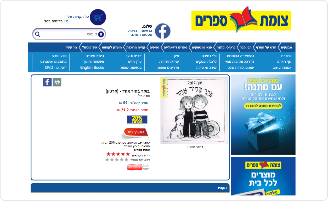
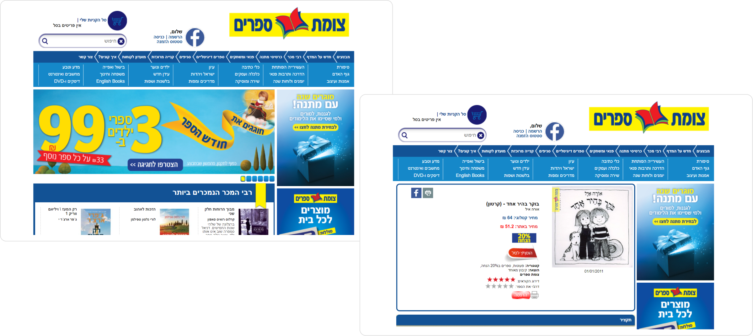
before
I chose to redesign the booknet website, making the experience easier and more helpful for different users.

the problems
1
Thousands of books
2
Different persona types and ages
3
Limited visual content- cover book images only
4
The scripture content is the main issue
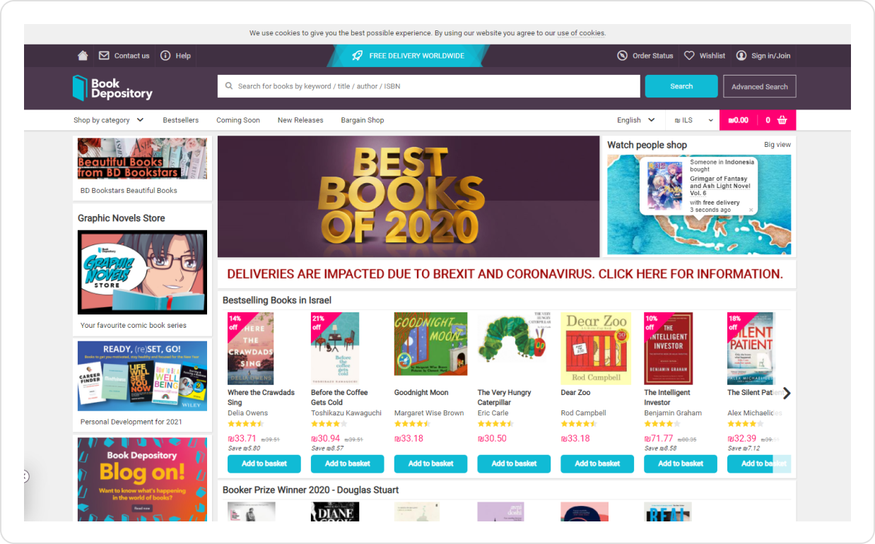
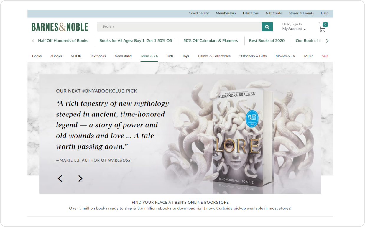
Competition research
The best books e-commerce sites use excellent menus, sophisticated navigation system. While centering attention to book reviews as the main subject.


the solutions
Better categorization method for better screening
Home
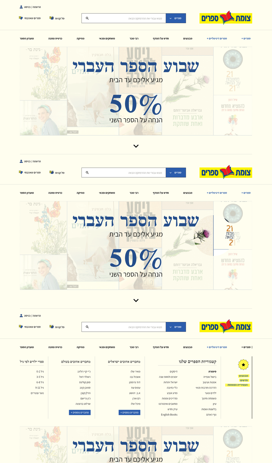
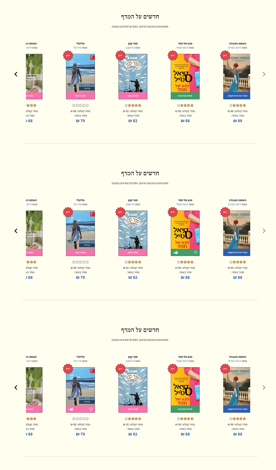
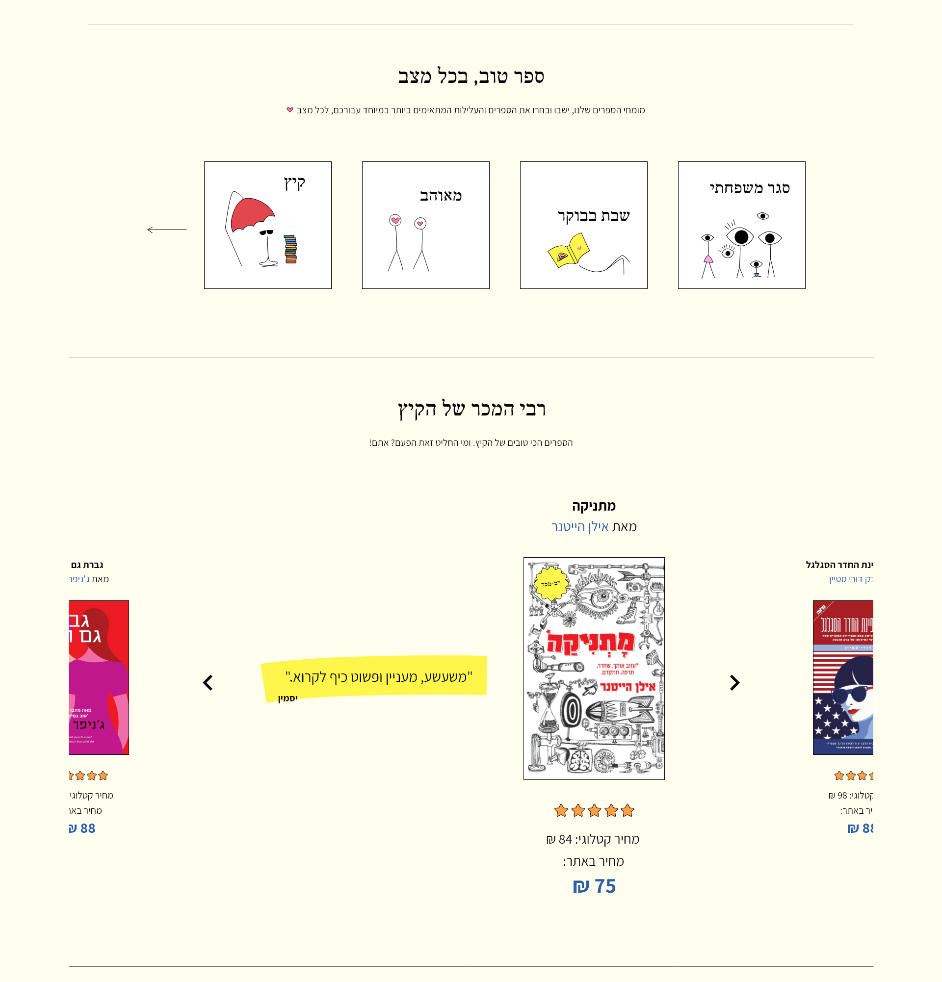
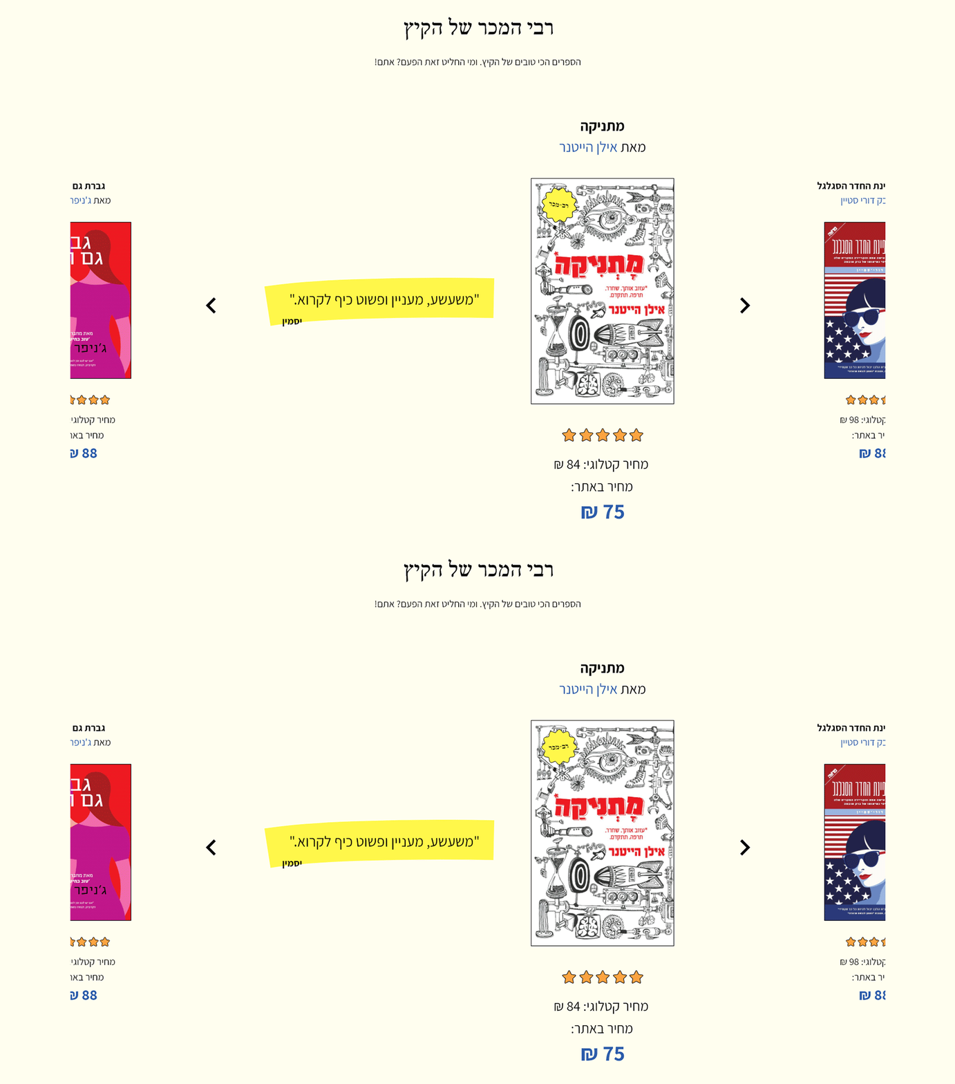
The home page contains NEW ON SHELF, BOOK FOR MOOD, BESTSELLERS, and SALE sections. The user can easily start scanning and navigate.
Menu
Megamenu is ordered by the most popular categories for book buying.
Labels
NEW, BESTSELLER, and OUR RECOMMENDATION labels on varied books across the website.
Colors
Books marked in different colors that represent their category. Another way to help our user know his way around.
Personal References
The world of books is personal and intimate, I wanted the website will provide a warm user experience to our buyers.
Wishlist And Personal Account
Especially For You
Microcopy
Review Writing Community
The Design
Using the brand colors and books inspiration world- yellowish pages, serif font for titles, and infant drawing.
Prototype link: click here
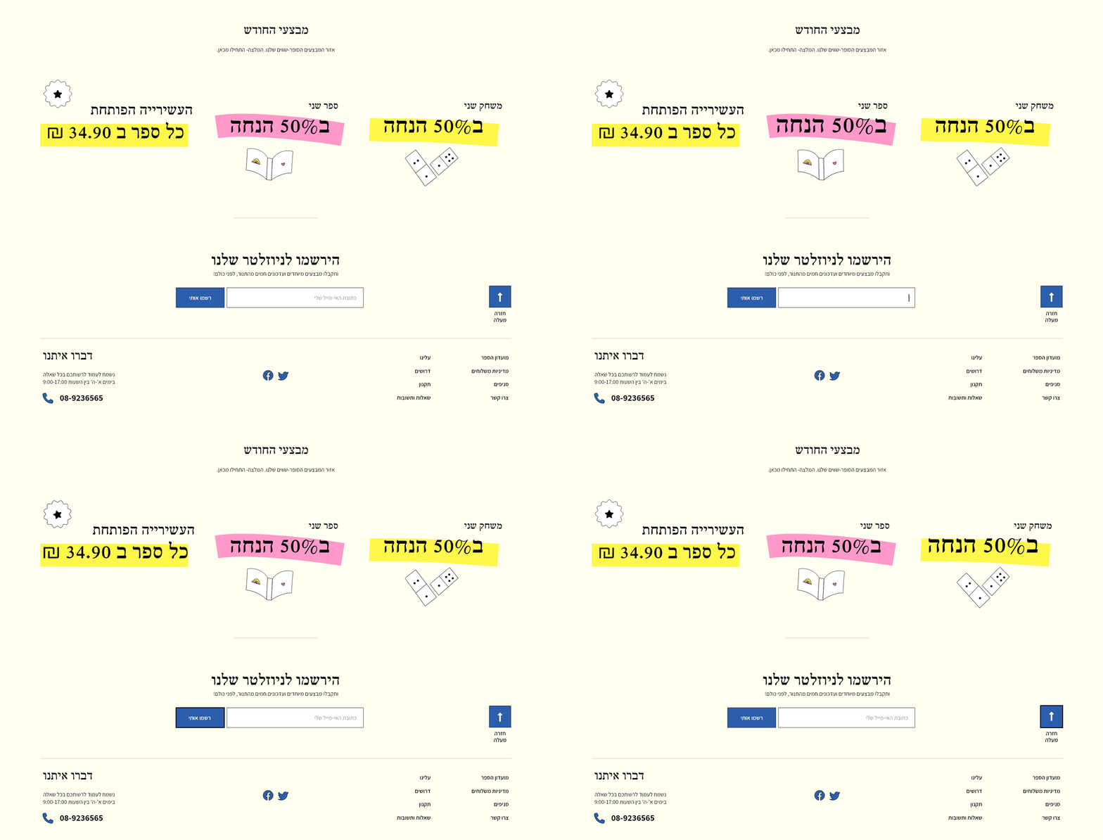
UI Library
Typography, colors, icons, and labels.
Thank you for discovering my Booknet project!
I Hope the project was interesting to you as it was for me.
Contact me right here- Contact Maya Armoza.